
Friday, March 14, 2008

Wednesday, March 12, 2008

the missing link
This is what I did in class on saturday. It was done in Corel painter, with mostly oils. I believe I did some impasto, and used the pen and felt pen features. And yes, "The Messing Link" is a play off "The Missing Link", so I attempted to give it a prehistoric look. I was going to make it look imprinted into the ground, like an asteroid had hit the earth or something. But, oh my gosh, this in itself, took quite some time.
I started it in Photoshop. And drew the letters in a normal perspective,and then used the transform tool. Which was a life saver. I remember at the time that I was drawing just the basic outlines, we hadn't gotten the Wacom tablets yet and I wasn't using a mouse. Anyways, long story short, transform saved my life, because I was getting pissed having to draw it with my finger on that little square sensor.
I started it in Photoshop. And drew the letters in a normal perspective,and then used the transform tool. Which was a life saver. I remember at the time that I was drawing just the basic outlines, we hadn't gotten the Wacom tablets yet and I wasn't using a mouse. Anyways, long story short, transform saved my life, because I was getting pissed having to draw it with my finger on that little square sensor.
Monday, February 25, 2008

This guy was something I doodled in class a few weeks ago. I was going to use this for the line drawing exercise. So, I'm uploading it now, as an original, so that it can be compared to whatever I do with it next.
AND...I also reflected lightening in the water on that piece that's a few posts down. Ha, I had no idea that you could change the opacity of a layer. I just never thought of it--but making something look reflected is as simple as flipping the image and changing the opacity.
Here it tis:

Patterns
Well, I decided to take a stab at the background handout. Using my version 5 photoshop. lol It worked well. The original photo was one that I took about a year ago of some trusses that were lined up on the side of the road. And I had already altered it in photoshop, so technically it's not the original.
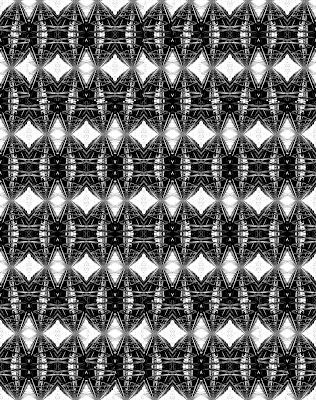

And here's the end result--plus two of the same images that I experimented with filters on. I loved experimenting with the filters.

I chose the two that I thought looked the most interesting. The first was underpainting, and made the image more block-like. 
The second image I used the bas relief filter--which made the pattern look like that metal that's used for like ceilings and walls. I don't particularly know what its called, but I'm pretty sure everyone knows what I'm talking about.
Thursday, February 14, 2008
Aqua Maestro!
Last class period we scanned in our collages, made from pictures, etc. cut out of magazines. I really enjoyed making it! I feel like I haven't done anything like it since I was a kid. I really got lost in it though, and created something reminiscent of what I'd think an LSD trip would look like. The two magazines that I used were, a yacht magazine and Seattle Homes--therefore, my theme is centered around architecture and the ocean. Which then transformed into being about the little pengin in the center, the Aqua Maestro.
Here's the original:
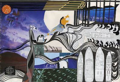
And here's the edited-photoshop version:
Here's the original:

And here's the edited-photoshop version:

It's not much different, but I think I still like the original better. When editing the collage, I used mostly layers, and manipulating the layers with the filters. I did a little bit of other things, like cloning, and copying images.
The other piece I did in class last saturday was a photo that I manipulated by creating layers, and moving other images onto that photo. And after I'd done that I moved it into Corel, fiddled around with it and then moved it back into photoshop. I still want to reflect the lightening in the water. I'm not exactly sure how to do that.
Subscribe to:
Posts (Atom)